D2L Creator+ Elements are features which can be used to deliver notable, visual, related, or sequenced information in your HTML course content files. Elements allow faculty to quickly and easily build highly appealing, interactive, and enjoyable experiences with course content to improve comprehension and achieve student engagement.
Adding an Element
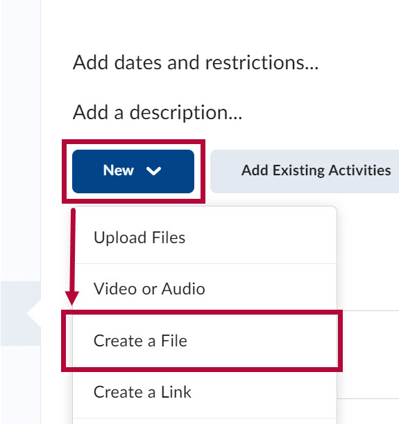
- From the Navbar, select [Content].

- From any content module, click [New] and select [Create a File].
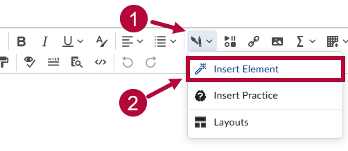
- From the WYSIWYG/HTML Editor toolbar, select the [Paintbrush & Pencil icon] (Creator+ Authoring Tools) followed by [Insert Element].
- Select the desired element you want to insert from the Insert Element menu.
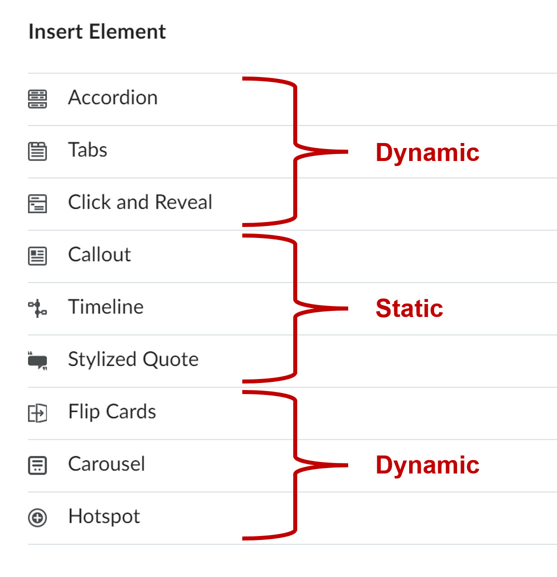
There are nine elements to choose from. Some elements are static, while others are dynamic. Details about each element can be found below.NOTE: After selecting an element from the menu, you will be taken to the insert element edit window to create the element. You are only required to fill out the required fields marked with an asterisk (*). Any fields NOT marked with an asterisk are optional. Once you are finished, you must select the blue [Preview] button, followed by [Save]. Be sure to also Save and Close the HTML file itself.


More Information
For more information on Creator+ features, watch a deep-dive webinar.
NOTE: Currently, Read Speaker cannot read text content within certain parts of certain Creator+ elements. The areas Read Speaker is not able to read are described below:
- Accordion (Panel content)
- Tabs (Panel content)
- Click and Reveal (Revealed content)
- Callout (Body content)
- Timeline (Panel content)
- Carousel (Slide text that isn't title)
- Hotspot (Marker content)
Insert Element Options
Accordion
Accordions are dynamic vertical containers that consist of multiple collapsible sections, each with its own header and content. When a student clicks on an accordion tab, the tab expands or collapses. This allows students to selectively view the information they are interested in, while keeping the rest of the content hidden.
Choose between numbered or unnumbered accordion tabs.

The labeled components in the image below are the editable components of this element. B and C are editable for every accordion tab.

Tabs
Tabs act as dynamic navigation components. When a student clicks on a tab, the associated content is displayed. Tabs are particularly useful when you want to present related but distinct pieces of information within a confined space. Adding images to your tabs is optional.
Choose between a Vertical or Horizontal orientation.

The labeled components in the image below are the editable components of this element. B, C, and D are editable for every tab.

Click and Reveal
Click and Reveal elements are dynamic text boxes which expand or collapse at the click of a button to reveal or hide information. Use them to increase engagement with content or to help declutter content heavy pages.
Choose between two format options, No Icon (text only) or Question.

The labeled components in the image below are the editable components of this element.

Callout
Callouts are static text boxes which can be used to bring attention to important information within your course content pages. Callouts include a required content field and an optional title field.
Choose between four format options: No Icon, Question, Attention, or Jumbo.

Timeline
Timelines are static elements which can be used for multiple purposes, such a illustrating key events over time or for listing steps involved in a process. Each timeline panel includes an optional content field and an optional title field.
Choose between two alignment options, left aligned or alternating. The example below shows a timeline with an alternating format.

Stylized Quote
Stylized Quotes can bring attention and raise impact for any quotes you may want to include in your course content pages. Each stylized quote includes a required quotation field and an optional attribution field.
Choose between two format options, Standard or Large Focus.

Flip Card
Flip Cards are interactive cards which can be used to capture attention and convey visual information in an engaging way. When clicked, flip cards flip around to reveal information on the other side. Each flip card includes optional Title, Image, and Content fields on both sides of the flip card.

The labeled components in the image below are the editable components of this element. B, C, and D are editable components on both the front and back of the flip card.

Carousel
Carousels allow you to create a series of slides in order to showcase information accompanied with images in an interactive way. Each slide in a carousel includes an optional title, image, and text field.

The labeled components in the image below are the editable components of this element. B, C, and D are editable on every carousel slide.

Hotspot
Hotspot elements allow you to upload images and specify particular areas of the image for students to click and obtain information. Each hotspot you add must include a name, adding additional content is optional. You also have the option of changing the hotspot marker design and color for each hotspot you add to the image.
NOTE: When creating a Hotspot, you will be required to chose between two accessibility options, [Accessible Hotspots Only] or [Fully Accessible Image].
- [Accessible Hotspots Only] allows you to provide a micro alt tag for each hotspot.
- [Fully Accessible Image] allows you to overlay your image with a grid that positions each hotspot into a cell in order to provide an micro alt tag for each cell.

Additional Details
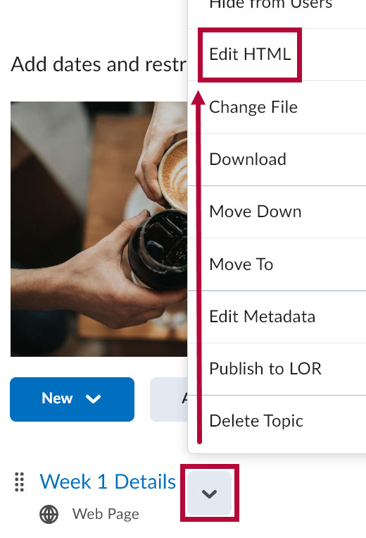
To edit, move, or delete a previously created element from an existing course file. You must open the HTML course file containing the element(s) in Edit mode.
- Locate the HTML course file from the Content area of your course and select [Edit HTML] from the context menu.
-
With the file opened in Edit view, click anywhere inside the element to generate the small option bar shown below.
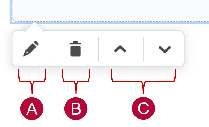
A. Opens the element in edit view.
B. Deletes the element.
C. Moves the element above or below other content in the course file.

