For documents created in Microsoft Word 365, check the following accessibility guidelines for each document element to make sure that your document is accessible.
Make Text Accessible
Use a text font that is easy to read
- Ensure your text is readable by using a sans serif fonts, such as Arial, Helvetica or Verdana, that is at least 10pt in size. These font settings will magnify well for those who have low vision.
- If there is an image that includes text, make sure to repeat that text in the alternative text field for the image so it will be accessible to assistive technology users.
- Refrain from using floating text boxes, track changes, or commenting - these features are not accessible.
Make Headings Accessible
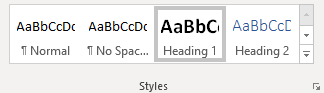
Use properly formatted headings to structure the page
- Select the text that you want to make into a heading.
- Go to the Home tab.
- In the Styles group, choose the appropriate heading level (see information below on using headings in the proper order) from the Styles gallery.

NOTE: The default style called a normal template in MS Word uses light blue heading colors that have insufficient color contrast. Make sure to change those headings to a darker color.
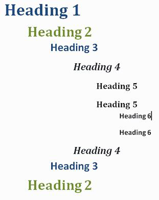
In addition to formatting headings as headings, the headings need to be used in the correct order. Headings chunk your content, making it easier for everyone to read. Headings are also one of the major ways screen readers navigate a document.
- Headings formatted in the proper order function like an outline for the document.
- Heading 1 is like the title of a book; there is just one per page. Heading 2s are like chapter titles. Heading 3s are sections of those chapters, and so on.
- To make a document accessible, don't skip heading levels.
- It can be helpful to view the Navigation Pane while applying structure to a Word document. This allows you to see the headings in outline format to make sure you haven't skipped a heading level.
- See below for a visual display of a possible heading order:

Make Lists Accessible
Use properly formatted lists
Page formatting for document elements such as lists is read aloud to screen reader users so the content is understood in context.
- Click the Home tab.
- In the Paragraph group, select the Numbering or Bullets icon.
- Use Number lists if a sequential order is important to the list
- Use Bullet lists if all items are equal value.
Make Images and Graphics (including Graphs, Maps, and Shapes) Accessible
Provide alternative text descriptions (alt text) for images and graphics.
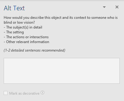
- Right click on the image and select Edit Alt Text.
- The Alt Text pane opens on the right side of the document.
- Enter your descriptive alternative text into the field provided.

Make Links Accessible
Write meaningful link text that indicates link's destination
Links are a major method of navigating for everyone, but especially screen reader users. If the links are embedded into meaningful text, they are much more useful.
- Highlight text that describes the destination of the link.
- Right click and select Link.
- In the Address field, type the link URL.
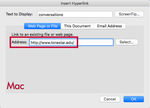
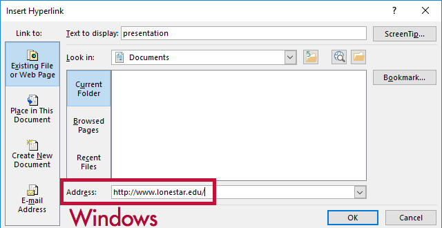
- Click OK.


- If you think students will be printing the document and you want them to have the URL, put it in parentheses after the link but don't hyperlink it.
- Example: Lone Star College (www.lonestar.edu).
- Screen reading software can pull up all of the links in a page to aid the user in navigating the page more quickly. If a link pulled up by the screen reader is an indecipherable URL or an ambiguous phrase like "click here," the user will not know where that link goes.
Make Tables Accessible
Create data tables with column headers
Windows:
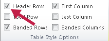
- Put your cursor in the top row of your data table so the Table Tools tabs display on the Ribbon.
- Under the Table Tools tab, click the Design tab.
- In the Table Style Options group, verify the Header Row box is checked.
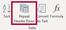
- Next, click the Layout tab under the Table Tools tab.
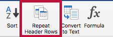
- In the Data group, click Repeat Header Rows.


Mac:
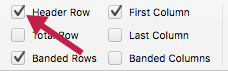
- Put your cursor in the top row of your data table. Two tabs display in the Ribbon, Table Design and Layout.
- Click the Design tab, and then verify the Header Row box is checked..
- Click the Layout tab.
- Click Repeat Headers Rows.


Ensure a proper reading order in tables
- Screen readers read tables from left to right, top to bottom, one cell at a time (no repeats). If cells are split or merged, the reading order can be thrown off.
- To test the reading order of your table, place your cursor in the first cell of the table. Press the Tab key repeatedly to navigate through the table. This demonstrates the reading order that assistive technologies will use.
- Merged, nested, and split cells change the reading order of tables. Make sure you construct your table in a way that accommodates proper reading order.
Color Use in Documents
Don't use color alone to convey meaning
Don't use color alone to make a distinction, to make a comparison, or to set something apart from the rest of the document. If you categorize something by color alone, those who are color blind or have other visual disabilities will not be able to benefit from that information.
Use sufficient color contrast
Make sure there is enough contrast between the font color and the background color. If you print your document on a black and white printer, would it be understandable? Without sufficient color contrast, people who are color blind or have other visual disabilities will not be able to benefit from that information.
How to Install and Use the Colour Analyser tool
- Download and install Colour Contrast Analyser Tool
- Open the Colour Contrast Analyser application
- Click the Foreground eye dropper tool, hover over and click the foreground color (usually text) to select it.
- Click the Background eye dropper tool, hover over and click the background color.
- If you have a 12pt font you are testing for color contrast, you must get a (AA) Pass for regular text.
If you have font larger than that, you must get a (AA) Pass for large text.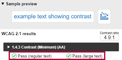

Colour Analyzer Tips:
- LSC's standards are to reach a pass in the AA standards.
- Don't worry if you fail the AAA standards, though you might want to consider something with more contrast.
Use of Flashing or Blinking Content
Eliminate flashing or blinking content
If you must use flashing or blinking content, limit that content to no more than 3 flashes per second. Any flashing or blinking content (especially content in red) can cause seizures in people with photosensitive epilepsy as well as other photosensitive seizure disorders, so this content should be used very rarely if at all. Pages that do contain flashing content should limit the flashing to no more than three flashes per second and should not use fully saturated reds in the content.
If you have a video containing a scene involving very bright lightning flashes (or other scenes with flashes), edit the video so the lightning doesn't flash more than three times in any one second period.
Make Interactive Elements Accessible
Forms & Buttons
- Label form fields and buttons
- We recommend the D2L quiz tool for creating forms and not MS Word. If you want to use Word to create your form, start with a form template.
- In order for a blind person to be able to fill out a form, the form needs to be electronic and the fields need to be associated with their corresponding labels.
- Make sure you check whether the screen reader tells the user what information to fill into the form fields?
Check the reading order of forms
- The reading order of a form is important to those who are blind or physically disabled.
- To check the reading order of a form, try tabbing through the form. Does the cursor land in the form fields in the expected order? If not, you need to edit the order of the form fields.
- If you are just making questions and leaving a space for answers instead of formatting your document as an actual form, make sure it is clear what you want the students to do. (For example, if you want students to fill in their responses to your questions below the question, write instructions so it's obvious to someone using a screen reader.)
Make Math and Science Equations Accessible
Math and Science Equations
Mathematical equations and scientific notations must be written with MathType (an Microsoft Office equation editor plugin) and saved in a source folder in your course files. This enables Disability Services to access those files and convert them to an accessible format for a visually impaired student.
For more information, see How to Make Math-Science Resources Accessible.
Run the Built in Accessibility Checker
A great way to begin checking the accessibility of your Word document is to use the built-in accessibility checker.
Windows:
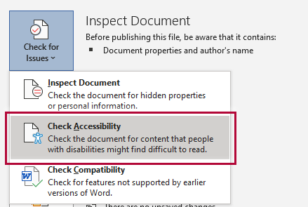
- Click the File tab.
- Select Info from the sidebar menu.
- Click the Check for Issues button.
- Select Check Accessibility from the drop-down list.

Mac:
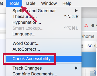
- Click Tools.
- Click Check Accessibility.

The Accessibility Checker panel will open to the right of the document. The accessibility checker provides you with a list of errors, warnings, and tips. When you click on an error or warning, instructions on how to fix it appear below the list of errors, in "Additional Information."