Lone Star College recognizes and supports the principles set forth in federal and state laws designed to eliminate discrimination against qualified individuals with disabilities. The College believes in equal access to educational opportunities for all individuals and is committed to making reasonable accommodations, including providing auxiliary aids and services, for qualified individuals with disabilities as required by law.
Building Accessible Courses
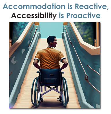
Individual student accommodation remains an important part of creating equitable access to online education. However, there are several proactive steps faculty can take to build accessible content and incorporate universal design strategies to enhance the accessibility of their online course.
 |
Accessible online content can be compared to physical wheelchair ramps and accessible entryways, it provides a digital pathway and allows all students to enter and utilize the course.
|
To get assistance with implementing accessible practices, using tools such as Ally and EquatIO, or to ask questions about accessibility, please contact the office best suited to assist you:
- Campus Technologists / VTAC Support: Assistance with D2L tools, technology, and accessible course content guidance.
- Instructional Designers: Assistance with accessible course design best practices.
- Disability Services: Assistance with course accommodations and support for specific student accommodations.
- Accessibility Services and Resources: Assistance with public accessibility inquiries, legal compliance for campus or system-wide access, and employee accommodations.
- Tips for Creating and Testing Accessible Content: Resources and guidance for creating and testing accessible content, created by Library Services.
- Accessibility Checklist by Library Services: Not sure where to get started with accessibility? This checklist offers a simple, practical guide to help you ensure your content, technology, or project is usable by everyone. From basic design considerations to essential compliance steps, it’s an easy way to begin building more inclusive experiences.
Select a format for accessibility tips and instructions:
 Microsoft Word Microsoft Word
|
 Microsoft PowerPoint Microsoft PowerPoint
|
 Microsoft Excel Microsoft Excel
|
|
|

D2L Content via Ally |
 Math Math
|

Videos and Media |
||
Accessibility Training Recordings
Below are some training recordings about accessibility tools. Check out our Training Calendar for upcoming sessions related to accessibility.
- "Advancing Equity with an Accessible Online Course" (0:28)
- "Increase Equitable Access with Ally" (0:45) (slides)
- "Quality Matters Mini: Accessibility" by Alex Suchon (0:36)
- "Equatio and Accessibility in STEAM" by Adriana Novaes (0:31) (slides) - NEW
- "Equatio for Accessibility and More" by Adriana Novaes (0:41) (links)
- "Make YuJa Videos Accessible at Scale" by YuJa (0:19) - NEW
- "Caption Accessibility Best Practices" with Jayne Davids (1:06)
- "YuJa Lumina Video: Beyond the Basics" with Yennhu Nguyen (0:39)
- "Tagging PDF Files" from LSC-HN Power Hour (0:29) - NEW
Accessibility and Usability Resource Site by QM
Included in our membership to Quality Matters is access to their "Accessibility and Usability Resource Site." Instructions to register are below.
- Log into (or create) your QM account associated with Lone Star College to access MyQM.
- Click on Workshop - Register on the left menu and choose Register for Accessibility & Usability Resource Site.
- Click the Register for Session button.
- Agree to both terms and click Continue.
- Enter your LSC email address, which should be the email address you used to create your account.
- The cost of training should be $0. Click Finalize Registration.
After registering, it can take up to an hour to get access to the site. To access the site:
- Log back into MyQM
- Click on Classroom in the top menu.
- Choose Accessibility and Usability Resource Site in the dashboard list.